

Most people don’t think about their website until something goes wrong with it. A form stops submitting. A page takes forever to load on a phone. A customer calls asking why they can’t find the contact page. That’s usually the moment someone starts googling around, trying to figure out what actually makes a website good — not just pretty, but functional.
Here’s the truth: a website can look stunning in a portfolio screenshot and still fail miserably the moment a real visitor tries to use it on their phone, on a slow connection, or with a screen reader. Design and function are two different jobs, and both need to be done well before you can call something finished.
This guide walks through the practical side of things — how to actually judge whether a website works the way it should, why so many businesses are rethinking their mobile experience this year, and what’s changing in web design heading into 2026. By the end, you’ll have a clear checklist you can use whether you’re building your first site, auditing an old one, or trying to explain to a developer why “it looks fine to me” isn’t the same as “it works.”
Core Criteria for Judging a Website's Design and Functionality
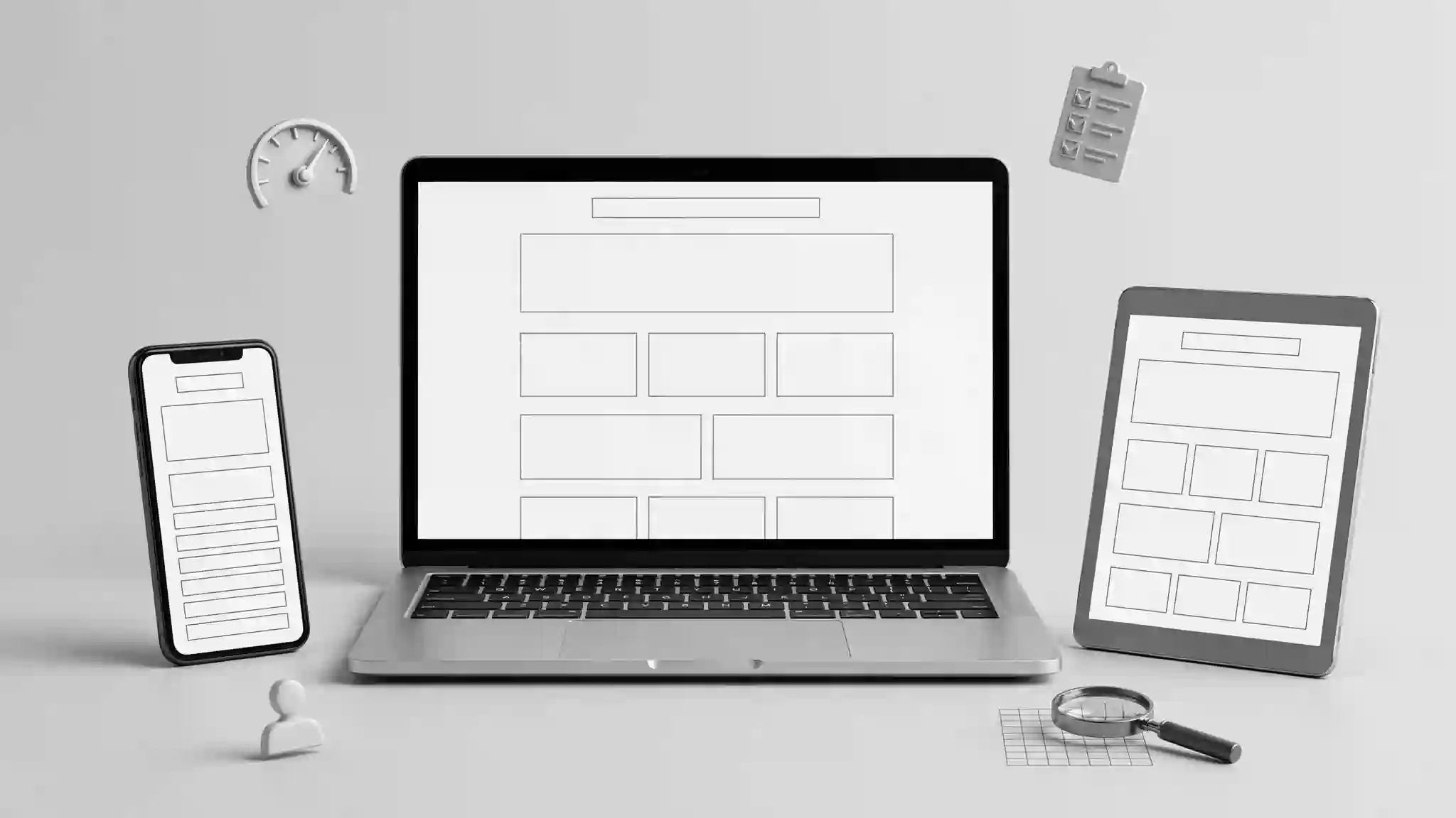
When people talk about evaluating a website, they usually jump straight to appearance — colors, fonts, logo placement. That stuff matters, but it’s only the surface layer. Underneath it, there’s a whole set of things that decide whether a visitor actually accomplishes what they came to do.
Loading Speed and Performance
If a page takes more than a couple of seconds to load, a meaningful chunk of visitors will simply leave before they see anything. Speed isn’t a nice-to-have; it’s the first test a website has to pass. Large uncompressed images, bloated code, and too many third-party scripts are usually the culprits. Tools like Google PageSpeed Insights or GTmetrix will show you exactly where the slowdowns are hiding.
Navigation Logic
Can a first-time visitor find what they’re looking for in under three clicks? That’s the rough benchmark most usability experts work with. Menus should be predictable, labeled in plain language, and consistent from page to page. If your “Contact Us” link is buried three submenus deep, you’ve already lost people.
Broken Links and Dead Ends
Nothing kills trust faster than clicking a button and landing on a 404 error. Regularly crawling your site for broken internal and external links should be a routine maintenance task, not an afterthought.
Form Functionality
Contact forms, checkout forms, newsletter sign-ups — these are often where the real business happens, and they’re also where things quietly break. A form that doesn’t send a confirmation email, or one that fails silently without telling the user, can cost real revenue without anyone noticing for weeks.
Cross-Browser Consistency
A site that looks perfect in Chrome but falls apart in Safari or Firefox isn’t finished. Testing across browsers (and their different versions) is a step a lot of smaller projects skip, and it shows.
Accessibility
Alt text on images, proper heading structure, sufficient color contrast, keyboard navigation — these aren’t just legal checkboxes in some regions, they’re the difference between a site that welcomes everyone and one that quietly excludes a chunk of its audience.
Put together, these points form a fairly reliable set of website design functionality evaluation criteria that you can run through before calling a project “done.”
When You Genuinely Need Website Help

There’s a point in almost every website project where DIY tools stop being enough. Maybe the site has grown past what a simple builder can handle, or maybe something technical broke and nobody on the team knows how to fix it. Recognizing that moment early saves a lot of frustration.
Signs you need outside website help:
- Your site’s loading speed hasn’t improved despite compressing images and clearing caches
- You’re getting customer complaints about broken checkout or contact processes
- Your bounce rate has climbed sharply and you can’t pinpoint why
- You want custom functionality (a booking system, a member portal, an integration) that your current platform can’t support out of the box
- Google Search Console is flagging mobile usability or indexing errors you don’t understand
Getting help doesn’t always mean hiring a full agency. Sometimes it’s a freelance developer for a few hours, a plugin built for exactly your problem, or even a detailed forum thread that walks you through the fix. The key is not letting a broken piece of your site sit untouched for months just because fixing it feels intimidating.
Why Mobile Design Can No Longer Be an Afterthought

There was a time when businesses built a desktop site first and then, almost apologetically, made a stripped-down mobile version. That approach doesn’t hold up anymore. More people browse, shop, and research on their phones than on any other device, and search engines have adjusted their ranking systems to reflect that shift — Google, for instance, primarily uses the mobile version of a page for indexing and ranking.
This is where the mobile friendly website design importance really becomes obvious. A site that isn’t built mobile-first tends to show its cracks fast: text too small to read without zooming, buttons too close together to tap accurately, images that don’t resize, and menus that require pinching and scrolling just to open.
A genuinely mobile-friendly site does a few things well:
- Responsive layouts that reshape content based on screen size, rather than just shrinking a desktop layout
- Thumb-friendly navigation, with tap targets large enough and spaced well enough to avoid mis-clicks
- Fast mobile load times, since mobile data connections are often slower and less stable than home Wi-Fi
- Simplified forms, because typing on a phone keyboard is naturally more error-prone than on a desktop
- Readable typography without requiring zoom
If you’re not sure where your own site stands, Google’s Mobile-Friendly Test tool gives a quick diagnostic. It’s not perfect, but it catches the obvious problems fast.
What Actually Makes a Really Great Site

Ask ten people what makes a website great and you’ll get ten different answers — one person says design, another says speed, another says trust. The honest answer is that greatness isn’t one thing. It’s the absence of friction.
Think about the last website you used that felt effortless. You probably didn’t notice the design at all — you just found what you needed and moved on. That invisibility is actually the goal. A really great site doesn’t ask visitors to think about how to use it; it just works.
A few traits show up again and again in sites that people genuinely enjoy using:
- Clarity over cleverness. Fancy animations and unconventional layouts can look impressive in a case study, but if they confuse a first-time visitor, they’re working against the site’s purpose.
- A clear next step on every page. Whether it’s “Buy Now,” “Book a Call,” or “Read More,” visitors shouldn’t have to guess what they’re supposed to do.
- Consistency. Fonts, colors, button styles, and tone should feel like they belong to the same brand from the homepage to the checkout page.
- Trust signals. Real testimonials, visible contact information, secure payment badges, and an updated copyright year all quietly tell a visitor “this is a legitimate, maintained business.”
- Personality. The best sites don’t feel like they were built from a template with the logo swapped out. Small touches — a distinctive tone in the copy, a custom illustration style, thoughtful microcopy — go a long way.
Innovative Web Design Trends Shaping 2025 Into 2026

Web design doesn’t stand still, and the last couple of years have pushed things in some genuinely interesting directions. If you’re planning a redesign or building something new, it’s worth knowing where the industry is heading.
AI-Personalized Experiences
More websites are quietly adjusting content based on visitor behavior — showing different homepage sections to a returning customer versus a first-time visitor, or recommending products based on browsing patterns. This used to require huge engineering teams; now it’s increasingly built into off-the-shelf platforms.
Micro-Interactions and Motion
Small animations — a button that gently changes shape on hover, a subtle loading indicator, a card that lifts slightly on scroll — are being used to guide attention without overwhelming the page. Done well, these details make a site feel alive without slowing it down.
Voice and Conversational Interfaces
Chat widgets have evolved well past scripted FAQ bots. Many sites now embed conversational assistants that can answer specific product questions, pull order status, or guide someone through a form in real time.
Dark Mode as Standard
What used to be a niche preference is now something users actively expect as an option, especially on content-heavy or app-like sites.
Modular, Portal-Style Layouts
This is where innovative web portal design ideas 2025 to 2026 come into play. Businesses are increasingly building sites less like static brochures and more like portals — dashboards for customers, resource hubs for members, or self-service centers where users log in and interact with personalized content rather than just reading static pages. Think along the lines of a customer account area that shows order history, saved preferences, loyalty points, and support tickets all in one modular interface, rather than scattered across separate pages.
Accessibility-First Design
What used to be treated as a compliance requirement is increasingly treated as a design principle from day one — larger touch targets, better contrast ratios, and screen-reader-friendly structure baked into the initial design rather than patched in later.
Getting Website Display Right Across Every Screen
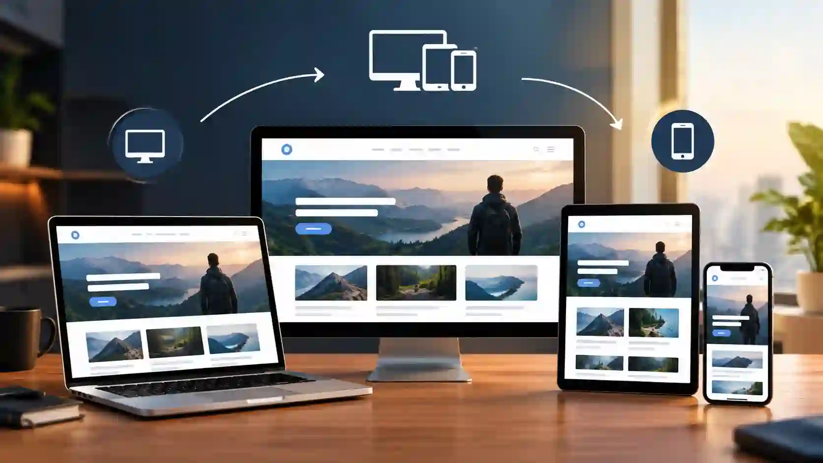
Website display issues are some of the most common — and most avoidable — problems out there. A site can have great content and solid functionality and still frustrate visitors simply because it doesn’t render correctly.
A few practical steps to keep display consistent:
- Test on real devices, not just browser simulators. Emulators are useful but they don’t always catch the quirks of an actual older phone or a specific tablet size.
- Use flexible grid systems instead of fixed-pixel layouts, so content reshapes naturally across screen sizes.
- Compress and properly size images for different breakpoints, so a photo meant for a large desktop banner isn’t being forced onto a small mobile screen at full resolution.
- Check font rendering across operating systems — a typeface that looks crisp on one platform can look thin or oversized on another.
- Review dark mode and high-contrast settings, since some color combinations that look fine in standard mode become unreadable when a user’s system settings change.
Getting display right isn’t a one-time task — new devices, browser updates, and operating system changes mean it’s worth re-checking every few months.
Bringing It Together: A Simple Evaluation Checklist
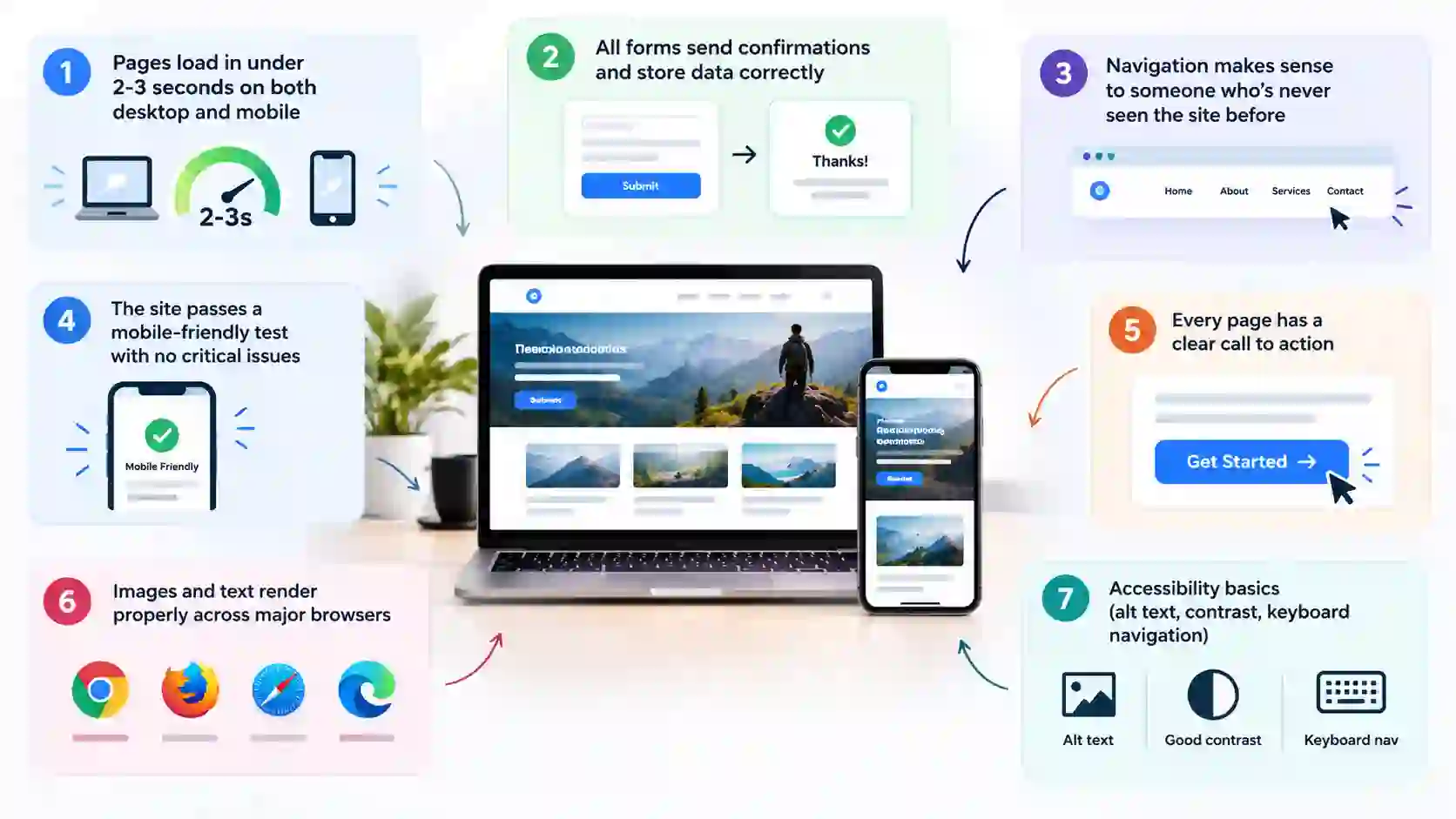
If you want a quick gut-check before launching or relaunching a site, run through this:
- Pages load in under 2-3 seconds on both desktop and mobile
- All forms send confirmations and store data correctly
- Navigation makes sense to someone who’s never seen the site before
- The site passes a mobile-friendly test with no critical issues
- Every page has a clear call to action
- Images and text render properly across major browsers
- Accessibility basics (alt text, contrast, keyboard navigation) are in place
- Broken links have been checked and fixed in the last month
If you’re also thinking about managing how devices access certain sites — for family safety, workplace focus, or personal digital habits — it’s worth checking our guide on How to Block Websites on Android, which walks through a few reliable methods for controlling site access on mobile devices.
Frequently Asked Questions
Q1. How often should I evaluate my website's functionality?
A light check-in monthly (broken links, form tests, speed check) and a deeper audit every six months is a reasonable rhythm for most small-to-medium sites.
Q2. What's the fastest way to tell if my site is mobile-friendly?
Run it through Google’s Mobile-Friendly Test, then actually use it yourself on your own phone for five minutes. Automated tools catch technical issues, but only real use catches awkward navigation.
Q3. Do I need a developer to fix most website functionality issues?
Not always. Many issues — image compression, broken links, plugin updates — can be handled without coding knowledge. More complex problems, like custom integrations or security vulnerabilities, usually do need professional help.
Q4. How to display Instagram feed on website?
The easiest way is using a feed embedding tool or plugin — many CMS platforms, including WordPress and Squarespace, offer built-in or third-party options for this — that connects to Instagram’s API and automatically pulls your latest posts into a widget on your page. Most of these tools let you customize the number of posts shown, the grid layout, and refresh frequency, without needing to touch any code.
Q5. Is a website portal different from a regular website?
Yes — a portal typically requires a login and shows personalized, interactive content (like account details or order history), while a standard website mostly shows the same static content to every visitor.